<!DOCTYPE html>
<html>
<head>
<meta charset="UTF-8">
<meta name="viewport" content="width=device-width, initial-scale=1.0">
<!-- // 반응형 웹을 만들기 위해서 위의 줄이 꼭 필요 -->
<title>Insert title here</title>
<link rel="icon" href="data:;base64,iVBORw0KGgo=">

<style type="text/css">
.box {
	width: 300px;
	height: 300px;
	margin: 30px auto;
	border: 3px dotted #333;
	padding: 10px;
	background: green;
}
/* 브라우저의 너비가 0~600 인 경우는 박스를 사라지게 하고 싶음.*/
@media (max-width:600px) {
	.box {
		display: none;
	}
}
</style>

</head>
<body>

<h3>반응형 웹</h3>

<p> 미디어 쿼리 : 각 미디어 메체에 따라 다른 스타일을 적용할 수 있게 만드는 것</p>

<div class="box"></div>
</body>
</html>

- max-width : 데스크탑의 가장 큰 화면 사이즈의 레이아웃을 기본으로 하고, 점차 축소하는 형태로 css 작성
<!DOCTYPE html>
<html>
<head>
<meta charset="UTF-8">
<meta name="viewport" content="width=device-width, initial-scale=1.0">
<!-- // 반응형 웹을 만들기 위해서 위의 줄이 꼭 필요 -->
<title>Insert title here</title>
<link rel="icon" href="data:;base64,iVBORw0KGgo=">

<style type="text/css">
* {
	padding: 0; margin: 0; box-sizing: border-box;
}

body {
	font-size: 14px;
	font-family: '맑은 고딕', 나눔고딕, 돋움, sans-serif;
}

.container {
	width: 1200px; margin: 20px auto 10px;
	border: 3px solid black;
}

.header {
	width: 100%; background: #e4f7ba;
	padding: 20px;
	text-align: center;
}

.body-main:after {
	content: ""; clear: both; display: block;
}

.article {
	float: left; width: 75%; height: 500px; background: #eee;
	padding: 15px;
}

.side {
	float: left; width: 25%; height: 500px; background: #faf4c0;
}

.footer {
	width: 100%;
	background: #9575cd;
	padding: 20px;
	text-align: center;
}

/*
  - max-width : 데스크탑의 가장 큰 화면 사이즈의 레이아웃은 기본으로 하고, 점차 축소하는 형태로 css 작성
*/

/* 화면 너비 : 0~1200 - 데스크탑 */
@media (max-width:1200px) {
	.container { width: 95%; border: 3px solid red; }
}

/* 화면 너비 : 0~768 - 태블릿 */
@media (max-width:768px) {
	.container { width: 100%; border: 3px solid green; }
}

/* 화면 너비 : 0~480 - 스마트폰 옆으로 늘일 때 */
@media (max-width:480px) {
	.container { width: 100%; border: 3px solid blue; }
	.header { height: 300px }
	.article { float: none; width: 100%; height: 300px };
	.side { float: none; width: 100%; height: 300px; }
}

/* 화면 너비 : 0~320 - 스마트폰 기본 */
@media (max-width:320px) {
	.container { width: 100%; border: 3px solid gray; }
}
</style>

</head>
<body>

<div class="container">
	<div class="header">
		<h1>헤더입니다.</h1>
	</div>
	<div class="body-main">
		<div class="article">
			메인입니다.
		</div>
		<div class="side">
			사이드입니다.
		</div>
	</div>
	<div class="footer">
		<h3>푸터입니다.</h3>
	</div>

</div>

</body>
</html>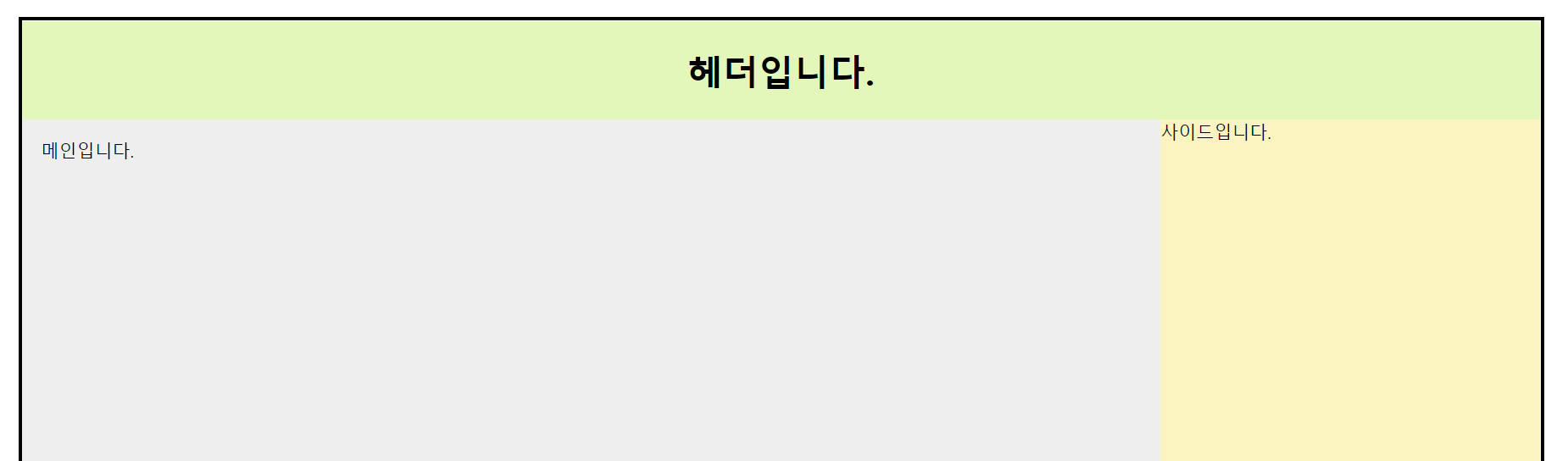
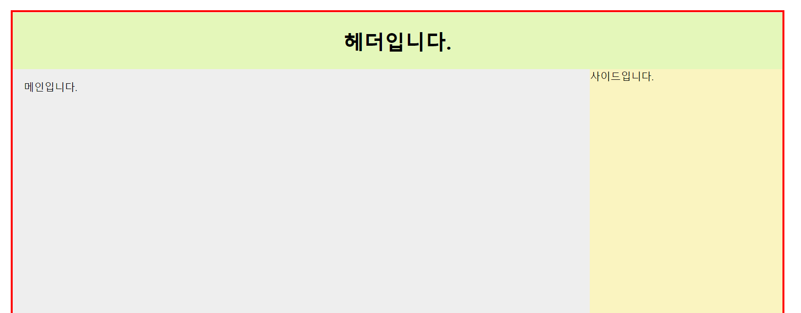
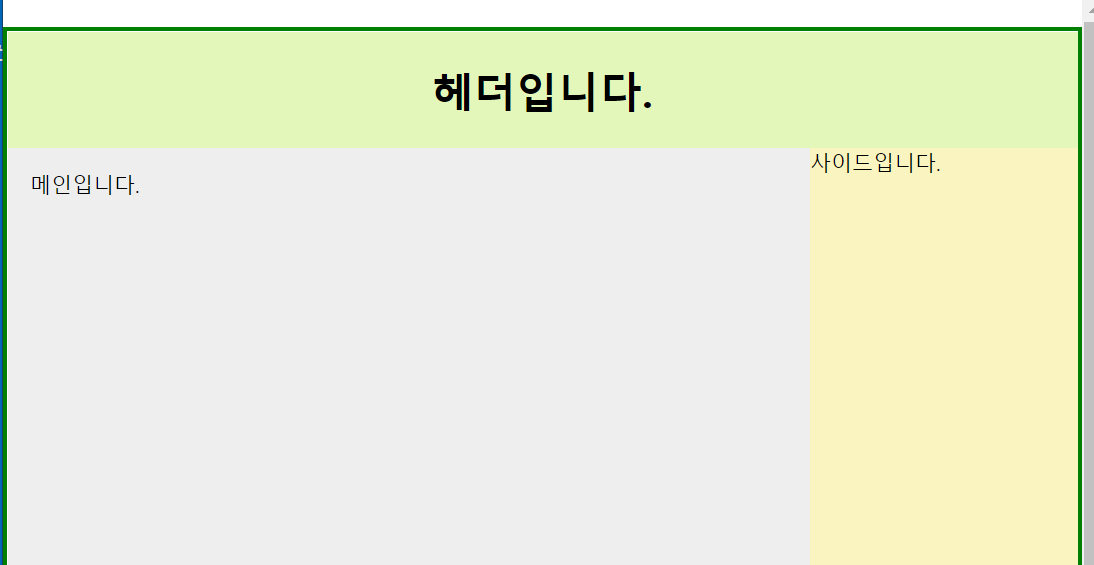

화면을 축소 함에 따라 테투리의 색이 변하는 것을 확인할 수 있다.
- min-width : 스마트폰 등 가장 작은 사이즈에서의 레이아웃을 기본으로 하고, 점차 확대되어가는 형태의 css
<!DOCTYPE html>
<html>
<head>
<meta charset="UTF-8">
<meta name="viewport" content="width=device-width, initial-scale=1.0">
<!-- // 반응형 웹을 만들기 위해서 위의 줄이 꼭 필요 -->
<title>Insert title here</title>
<link rel="icon" href="data:;base64,iVBORw0KGgo=">

<style type="text/css">
* {
	padding: 0; margin: 0; box-sizing: border-box;
}

body {
	font-size: 14px;
	font-family: '맑은 고딕', 나눔고딕, 돋움, sans-serif;
}

.container {
	width: 1200px; margin: 20px auto 10px;
	border: 3px solid black;
}

.header {
	width: 100%; background: #e4f7ba;
	padding: 20px;
	text-align: center;
}

.body-main:after {
	content: ""; clear: both; display: block;
}

.article {
	float: left; width: 75%; height: 500px; background: #eee;
	padding: 15px;
}

.side {
	float: left; width: 25%; height: 500px; background: #faf4c0;
}

.footer {
	width: 100%;
	background: #9575cd;
	padding: 20px;
	text-align: center;
}

/*
  - min-width : 스마트폰 등 가장 작은 사이즈에서의 레이아웃을 기본으로 하고, 점차 확대되어가는 형태의 css
*/

/* 화면 너비 : 320px 이상 */
@media (min-width:320px) {
	.container { width: 100%; border: 3px solid gray; }
	.header { height: 300px }
	.article { float: none; width: 100%; height: 300px };
	.side { float: none; width: 100%; height: 300px; }
}

/* 화면 너비 : 480px 이상 */
@media (min-width:480px) {
	.container { width: 100%; border: 3px solid blue; }
	.header { height: 100% }
	.article { float: left; width: 75%; height: 500px };
	.side { float: left; width: 25%; height: 500px; }
}

/* 화면 너비 : 768px 이상 */
@media (min-width:768px) {
	.container { width: 100%; border: 3px solid green; }
}

/* 화면 너비 : 1024px 이상 */
@media (min-width:1024px) {
	.container { width: 100%; border: 3px solid red; }
}

</style>

</head>
<body>

<div class="container">
	<div class="header">
		<h1>헤더입니다.</h1>
	</div>
	<div class="body-main">
		<div class="article">
			메인입니다.
		</div>
		<div class="side">
			사이드입니다.
		</div>
	</div>
	<div class="footer">
		<h3>푸터입니다.</h3>
	</div>

</div>

</body>
</html>
CSS파일을 따로 뺐을 때
@charset "UTF-8";

* {
	padding: 0; margin: 0; box-sizing: border-box;
}

body {
	font-size: 14px;
	font-family: '맑은 고딕', 나눔고딕, 돋움, sans-serif;
}

header {
	padding: 15px; text-align: center;
}

nav {
	overflow: hidden; background: #b70202;
}

nav>a {
	float: left; color: #fff; text-align: center; padding: 15px 12px; text-decoration: none;
	display: block;
}

nav>a:hover {
	font-weight: 600;
}

nav:after {
	content: ""; clear: both; display: block;
}

main .left {
	float: left; width: 75%; background: #eee; min-height: 500px; padding: 15px;
}

main .right {
	float: left; width: 25%; background: #faf4c0; min-height: 500px; padding: 15px;
}

main:after {
	content: ""; clear: both; display: block;
}

footer {
	padding: 20px; text-align: center; background: #e4f7ba;
}
@charset "UTF-8";
nav>a {
float: none;
}
main .left, main .right {
width: 100%; padding: 0;
}CSS파일을 연결해주는 link 태그 안에 media 속성을 이용한다.
<!DOCTYPE html>
<html>
<head>
<meta charset="UTF-8">
<meta name="viewport" content="width=device-width, initial-scale=1.0">
<title>Insert title here</title>
<link rel="icon" href="data:;base64,iVBORw0KGgo=">

<link rel="stylesheet" href="desktop.css" type="text/css">
<link rel="stylesheet" href="mobile.css" media="(max-width:480px)" type="text/css">

</head>
<body>

<header>
	<h1>반응형 웹</h1>
</header>
<nav>
	<a href="#">홈</a>
	<a href="#">스터디</a>
	<a href="#">공지사항</a>
</nav>
<main>
	<article class="left">
		<h3>메인 화면</h3>
	</article>
	<article class="right">
		<h3>사이드</h3>
	</article>
</main>
<footer>
	<h3>footer 영역</h3>
</footer>
</body>
</html>

반응형 그리드 레이아웃
- grid-template-columns: repeat(auto-fill, minmax(~)) 이용
<!DOCTYPE html>
<html>
<head>
<meta charset="UTF-8">
<title>Insert title here</title>
<link rel="icon" href="data:;base64,iVBORw0KGgo=">
<style type="text/css">
* {
	margin: 0; padding: 0;
	box-sizing: border-box;
}

header {
	padding: 15px; text-align: center;
}

main {
	padding: 15px;
}

footer {
	padding: 15px;
	text-align: center;
}

.box {
	margin: 0 auto;
	padding: 0;
	list-style: none;
}

.box>li {
	background: #eee;
	height: 200px;
}

.grid {
	display: grid;
	grid-template-columns: repeat(auto-fill, minmax(150px, 1fr));
	grid-column-gap: 8px;
	grid-row-gap: 8px;
}


</style>
</head>
<body>

<header>
	<h1>Grid Layout</h1>
</header>

<main>
	<ul class="box grid">
		<li></li>
		<li></li>
		<li></li>
		<li></li>
		<li></li>
		<li></li>
		<li></li>
		<li></li>
		<li></li>
		<li></li>
		<li></li>
		<li></li>
		<li></li>
		<li></li>
	</ul>
</main>

<footer>
	<h3>footer</h3>
</footer>
</body>
</html>'쌍용강북교육센터 > 10월' 카테고리의 다른 글
| 1007_JavaScript : 이미지 미리보기 (여러개) (0) | 2021.10.09 |
|---|---|
| 1007_JavaScript : 유튜브 주소 URL를 넣으면 동영상 출력 (0) | 2021.10.09 |
| 1006_ JavaScript : ip 기반 위도 경도 확인 (0) | 2021.10.07 |
| 1006_JavaScript : 웹 스토리지(Web Storage) (0) | 2021.10.07 |
| 1006_JavaScript : File, FileReader interface 파일관련인터페이스들 (0) | 2021.10.07 |