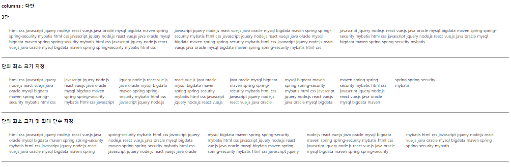
그리드 레이아웃이란 ?
- 페이지를 여러 주요 영역으로 나누거나, 크기와 위치 및 문서 계층 구조의 관점에서 HTML 기본 요소로 작성된 컨트롤 간의 관계를 정의하는데 아주 탁월하다.
- 테이블과 마찬가지로 그리드 레이아웃은 세로 열과 가로 행을 기준으로 요소를 정렬할 수 있다.
- 테이블과 달리 CSS 그리는 다양한 레이아웃을 훨씬 더 쉽게 구현할 수 있다.
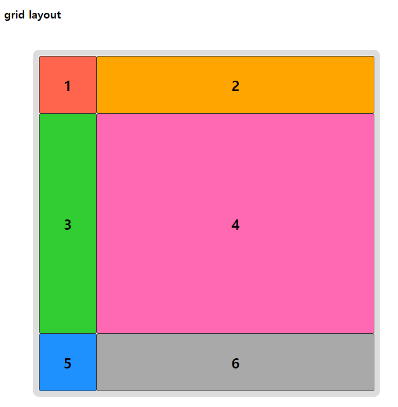
grid-template-rows
grid-template-columns
더보기
<!DOCTYPE html>
<html>
<head>
<meta charset="UTF-8">
<title>Insert title here</title>

<style type="text/css">
* {
	box-sizing: border-box; /* width 안에 border과 padding이 포함됨 */
}

.container {
	width: 600px; height: 600px; margin: 50px;
	background: #fff;
	border: 10px solid #ddd;
	border-radius: 10px;

	display: grid;

	/* 명시적으로 행/열의 크기를 지정 */
	grid-template-rows: 100px auto 100px; /* 총 3행 / 1, 3행은 100px를 줌 */
	grid-template-columns: 100px auto; /* 총 2열 / 1열은 100px를 줌 */
}

.item {
	font-weight: 900; font-size: 25px;
	border: 1px solid #333;
	border-radius: 3px;

	display: flex;
	align-items: center; /* 수직의 가운데 */
	justify-content: center;
}

.item1 { background: rgb(255,100,77); }
.item2 { background: rgb(255,165,0); }
.item3 { background: rgb(50,205,50); }
.item4 { background: rgb(255,105,180); }
.item5 { background: rgb(30,145,255); }
.item6 { background: rgb(169,169,169); }

</style>

</head>
<body>

<h3>grid layout</h3>

<div class="container">
	<div class="item item1">1</div>
	<div class="item item2">2</div>
	<div class="item item3">3</div>
	<div class="item item4">4</div>
	<div class="item item5">5</div>
	<div class="item item6">6</div>
</div>

</body>
</html>
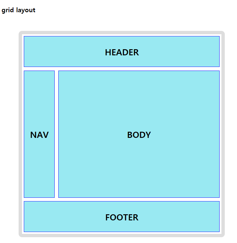
grid-template-areas
더보기
<!DOCTYPE html>
<html>
<head>
<meta charset="UTF-8">
<title>Insert title here</title>

<style type="text/css">
* {
	box-sizing: border-box; /* width 안에 border과 padding이 포함됨 */
}

.container {
	width: 600px; height: 600px; margin: 50px;
	background: #fff;
	border: 10px solid #ddd;
	border-radius: 10px;

	display: grid;

	/* 영역 이름을 참조해 템플릿 생성 */
	grid-template-rows: 100px auto 100px; /* 총 3행 / 1, 3행은 100px를 줌 */
	grid-template-columns: 100px auto; /* 총 2열 / 1열은 100px를 줌 */
	grid-template-areas:
		"header  header"
		"nav body"
		"footer footer";

	font-weight: 900;
	font-size: 25px;
}

.header {
	grid-area : header;
	border: 1px solid blue;
	background: #99e9f2;
	display: flex;
	margin: 5px 5px;
	justify-content: center;
	align-items: center;
}

.nav {
	grid-area : nav;
	border: 1px solid blue;
	background: #99e9f2;
	display: flex;
	margin: 5px 5px;
	justify-content: center;
	align-items: center;
}

.body {
	grid-area : body;
	border: 1px solid blue;
	background: #99e9f2;
	display: flex;
	margin: 5px 5px;
	justify-content: center;
	align-items: center;
}

.footer {
	grid-area : footer;
	border: 1px solid blue;
	background: #99e9f2;
	display: flex;
	margin: 5px 5px;
	justify-content: center;
	align-items: center;
}

</style>

</head>
<body>

<h3>grid layout</h3>

<div class="container">
	<header class="header">HEADER</header>
	<nav class="nav">NAV</nav>
	<article class="body">BODY</article>
	<footer class="footer">FOOTER</footer>
</div>

</body>
</html>
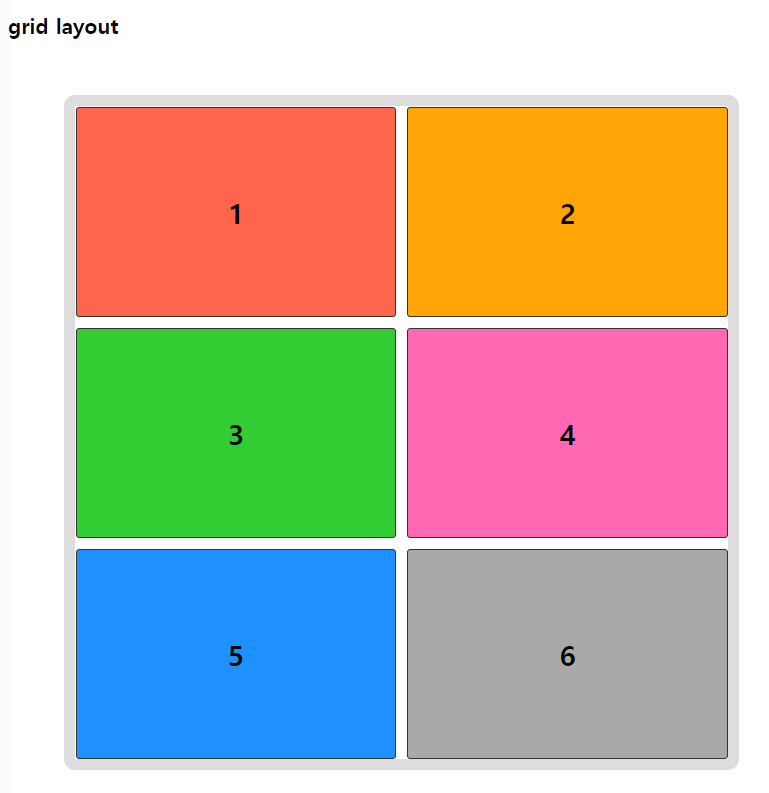
grid-template
더보기
<!DOCTYPE html>
<html>
<head>
<meta charset="UTF-8">
<title>Insert title here</title>

<style type="text/css">
* {
	box-sizing: border-box; /* width 안에 border과 padding이 포함됨 */
}

.container {
	width: 600px; height: 600px; margin: 50px;
	background: #fff;
	border: 10px solid #ddd;
	border-radius: 10px;

	display: grid;

	grid-template: repeat(3, auto) / repeat(2, auto);
	/* grid-template: repeat(3, 200) / repeat(2, 300); */
	/* 행 수가 3개 width는 auto, 열 수가 2개 height는 auto */
	gap: 10px; /* row-gap: 10px; column-gap: 10px; */
	/* 요소와 요소 사이의 공간 */
}

.item {
	font-weight: 900; font-size: 25px;
	border: 1px solid #333;
	border-radius: 3px;

	display: flex;
	align-items: center; /* 수직의 가운데 */
	justify-content: center;
}

.item1 { background: rgb(255,100,77); }
.item2 { background: rgb(255,165,0); }
.item3 { background: rgb(50,205,50); }
.item4 { background: rgb(255,105,180); }
.item5 { background: rgb(30,145,255); }
.item6 { background: rgb(169,169,169); }

</style>

</head>
<body>

<h3>grid layout</h3>

<div class="container">
	<div class="item item1">1</div>
	<div class="item item2">2</div>
	<div class="item item3">3</div>
	<div class="item item4">4</div>
	<div class="item item5">5</div>
	<div class="item item6">6</div>
</div>

</body>
</html>
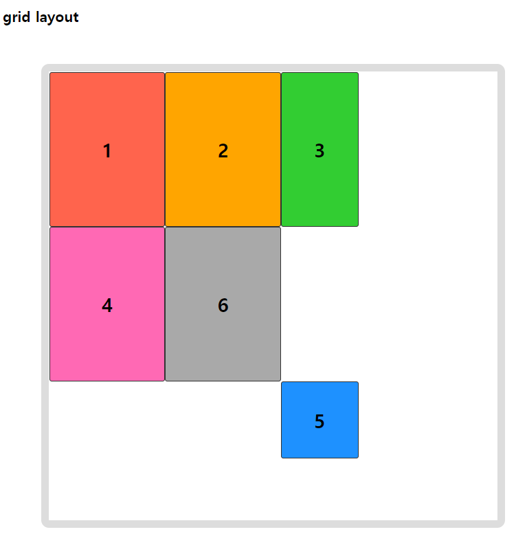
grid-auto-rows
grid-auto-columns
더보기
<!DOCTYPE html>
<html>
<head>
<meta charset="UTF-8">
<title>Insert title here</title>

<style type="text/css">
* {
	box-sizing: border-box; /* width 안에 border과 padding이 포함됨 */
}

.container {
	width: 600px; height: 600px; margin: 50px;
	background: #fff;
	border: 10px solid #ddd;
	border-radius: 10px;

	display: grid;

	/* 명시적으로 2개의 행과 2개의 열 크기 명시 */
	grid-template-rows: 200px 200px;
	grid-template-columns: 150px 150px;
	/* 암시적인 행, 열의 크기를 정의 */
	grid-auto-rows: 100px;
	grid-auto-columns: 100px;
}

.item {
	font-weight: 900; font-size: 25px;
	border: 1px solid #333;
	border-radius: 3px;

	display: flex;
	align-items: center; /* 수직의 가운데 */
	justify-content: center;
}

.item1 { background: rgb(255,100,77); }
.item2 { background: rgb(255,165,0); }
.item3 { background: rgb(50,205,50); }
.item4 { background: rgb(255,105,180); }
.item5 { background: rgb(30,145,255); }
.item6 { background: rgb(169,169,169); }

/* item요소들 중에 5번째 요소 */
.item:nth-child(5) { /* 아이템 배치 */
	grid-row: 3/4; /* start-line / end-line */
	grid-column: 3/4;
}

/* .item :nth-child / item의 자손요소중 5번째 요소*/

</style>

</head>
<body>

<h3>grid layout</h3>

<div class="container">
	<div class="item item1">1</div>
	<div class="item item2">2</div>
	<div class="item item3">3</div>
	<div class="item item4">4</div>
	<div class="item item5">5</div>
	<div class="item item6">6</div>
</div>

</body>
</html>
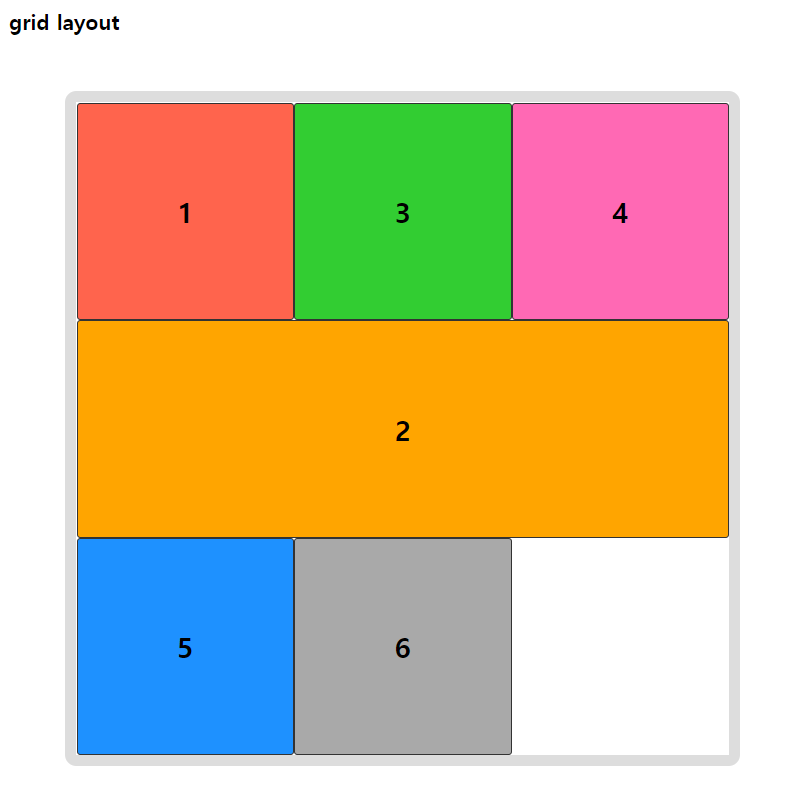
repeat, fr
grid-auto-flow
더보기
<!DOCTYPE html>
<html>
<head>
<meta charset="UTF-8">
<title>Insert title here</title>

<style type="text/css">
* {
	box-sizing: border-box; /* width 안에 border과 padding이 포함됨 */
}

.container {
	width: 600px; height: 600px; margin: 50px;
	background: #fff;
	border: 10px solid #ddd;
	border-radius: 10px;

	display: grid;

	grid-template-rows: repeat(3, 1fr); /* 1/3 의 의미 */
	grid-template-columns: repeat(3, 1fr);
	grid-auto-flow: row dense; /* 각 행 축을 따라 차례로 배치. 빈 영역을 메움 */
	/* grid-auto-flow: column dense; */
}

.item {
	font-weight: 900; font-size: 25px;
	border: 1px solid #333;
	border-radius: 3px;

	display: flex;
	align-items: center; /* 수직의 가운데 */
	justify-content: center;
}

.item1 { background: rgb(255,100,77); }
.item2 { background: rgb(255,165,0); }
.item3 { background: rgb(50,205,50); }
.item4 { background: rgb(255,105,180); }
.item5 { background: rgb(30,145,255); }
.item6 { background: rgb(169,169,169); }

.item:nth-child(2) {
	grid-column:span 3; /* 3칸에 출력 */
}
</style>

</head>
<body>

<h3>grid layout</h3>

<div class="container">
	<div class="item item1">1</div>
	<div class="item item2">2</div>
	<div class="item item3">3</div>
	<div class="item item4">4</div>
	<div class="item item5">5</div>
	<div class="item item6">6</div>
</div>

</body>
</html>
grid-row
grid-column
더보기
<!DOCTYPE html>
<html>
<head>
<meta charset="UTF-8">
<title>Insert title here</title>

<style type="text/css">
* {
	box-sizing: border-box; /* width 안에 border과 padding이 포함됨 */
}

.container {
	width: 600px; height: 600px; margin: 50px;
	background: #fff;
	border: 10px solid #ddd;
	border-radius: 10px;

	display: grid;

	grid-template-rows: repeat(4, 1fr);
	grid-template-columns: repeat(3, 1fr);
}

.item {
	font-weight: 900; font-size: 25px;
	border: 1px solid #333;
	border-radius: 3px;

	display: flex;
	align-items: center; /* 수직의 가운데 */
	justify-content: center;
}

.item1 { background: rgb(255,100,77); }
.item2 { background: rgb(255,165,0); }
.item3 { background: rgb(50,205,50); }
.item4 { background: rgb(255,105,180); }
.item5 { background: rgb(30,145,255); }
.item6 { background: rgb(169,169,169); }
.item7 { background: rgb(169,80,255); }
.item8 { background: rgb(95,95,95); }
.item9 { background: rgb(240,0,0); }

.item1 {
	grid-column:1/4;
}
.item2 {
	grid-row:2/4;
}
.item3 {
	grid-column:2/span2; /* 2열부터 두 칸 */
}
.item6 {
	grid-column:1/span3; /* 1열부터 세 칸 */
}

</style>

</head>
<body>

<h3>grid layout</h3>

<div class="container">
	<div class="item item1">1</div>
	<div class="item item2">2</div>
	<div class="item item3">3</div>
	<div class="item item4">4</div>
	<div class="item item5">5</div>
	<div class="item item6">6</div>
</div>

</body>
</html>
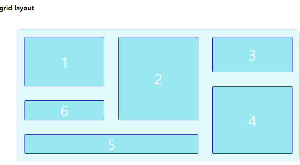
auto-fill
더보기
<!DOCTYPE html>
<html>
<head>
<meta charset="UTF-8">
<title>Insert title here</title>

<style type="text/css">
* {
	box-sizing: border-box; /* width 안에 border과 padding이 포함됨 */
}

.container {
	width: 800px;  /* 이게 없으면 알아서 조정 */
	margin: 50px;
	border-radius: 10px;

	padding: 20px;
	border: 1px solid #99e9f2;
	background: #e3fafc;

	display: grid;
	grid-gap: 40px;

	grid-template-rows: minmax(100px, auto);
	grid-template-columns: repeat(auto-fill, minmax(160px, 1fr));
	/* auto-fill: 행열의 개수를 자동으로 조정. 남는 공간은 그대로 유지 */
	grid-auto-flow: dense;
}

.container .item {
	border: 1px solid blue;
	border-radius: 3px;
	background: #99e9f2;
	font-size: 250%;
	color: #fff;

	display: flex;
	align-items: center;
	justify-content: center;
}

.container .item:nth-child(1) {
	grid-row-end: span 2;
}

.container .item:nth-child(2) {
	grid-row-end: span 3;
}

.container .item:nth-child(4) {
	grid-row-end: span 3;
}

.container .item:nth-child(5) {
	grid-column-end: span 2;
}


</style>

</head>
<body>

<h3>grid layout</h3>

<div class="container">
	<div class="item item1">1</div>
	<div class="item item2">2</div>
	<div class="item item3">3</div>
	<div class="item item4">4</div>
	<div class="item item5">5</div>
	<div class="item item6">6</div>
</div>

</body>
</html>
'쌍용강북교육센터 > 9월' 카테고리의 다른 글
| 0924_Javascript : 변수 Variable / 선언, 호이스팅 (0) | 2021.09.25 |
|---|---|
| 0924_Javascript : 개요 (0) | 2021.09.25 |
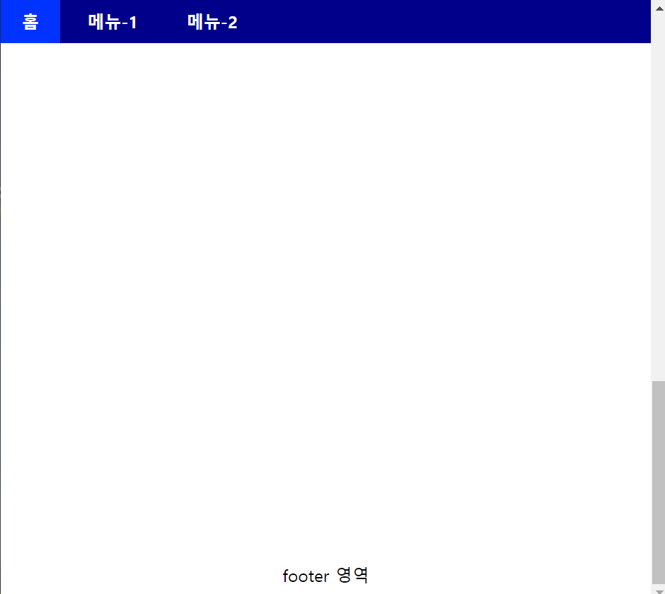
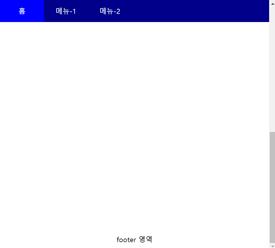
| 0923_CSS : display:flex를 사용하지 않고 메뉴 상단 고정 (0) | 2021.09.23 |
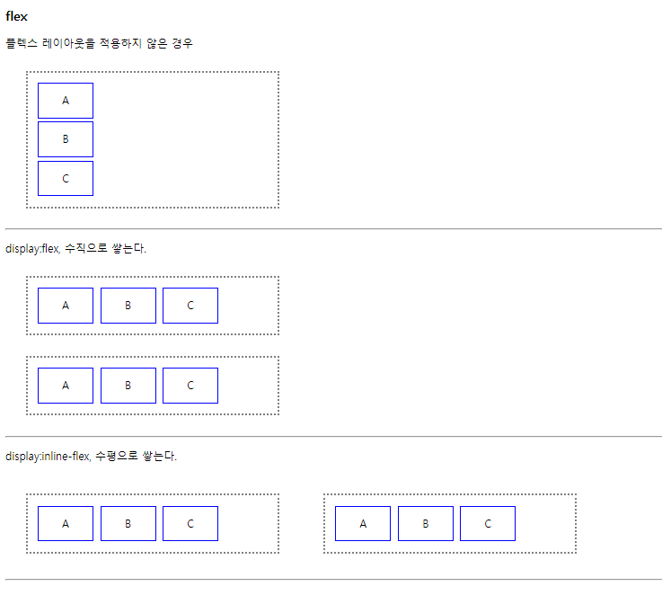
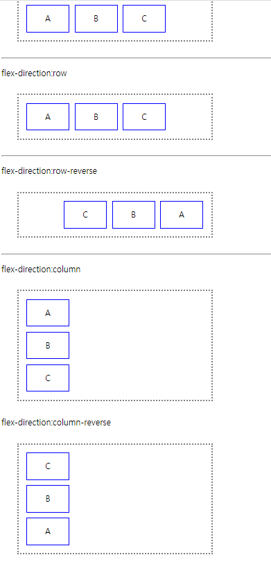
| 0923_CSS : flex 속성 (0) | 2021.09.23 |
| 0923_CSS : columns 다단 (0) | 2021.09.23 |