<!DOCTYPE html>
<html>
<head>
<meta charset="UTF-8">
<title>Insert title here</title>
<style type="text/css">
.flex-container {
	width: 350px;
	padding: 10px;
	margin: 30px;
	border: 3px dotted gray;
}

.flex {
	display: flex;
}

.inline-flex {
	display: inline-flex;
}

.box {
	width: 80px;
	height: 50px;
	line-height: 50px;
	text-align: center;
	margin: 5px;
	border: 1px solid blue;
}

</style>
</head>
<body>

<h3>flex</h3>

<p>플렉스 레이아웃을 적용하지 않은 경우</p>
<div class="flex-container">
	<div class="box">A</div>
	<div class="box">B</div>
	<div class="box">C</div>
</div>
<hr>

<p>display:flex, 수직으로 쌓는다.</p>
<div class="flex-container flex">
	<div class="box">A</div>
	<div class="box">B</div>
	<div class="box">C</div>
</div>
<div class="flex-container flex">
	<div class="box">A</div>
	<div class="box">B</div>
	<div class="box">C</div>
</div>
<hr>

<p>display:inline-flex, 수평으로 쌓는다.</p>
<div class="flex-container inline-flex">
	<div class="box">A</div>
	<div class="box">B</div>
	<div class="box">C</div>
</div>
<div class="flex-container inline-flex">
	<div class="box">A</div>
	<div class="box">B</div>
	<div class="box">C</div>
</div>
<hr>

</body>
</html>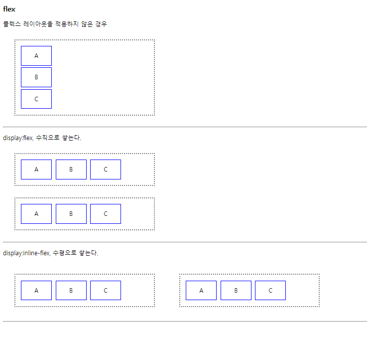
flex-direction
더보기
<!DOCTYPE html>
<html>
<head>
<meta charset="UTF-8">
<title>Insert title here</title>
<style type="text/css">
.flex-container {
width: 350px;
padding: 10px;
margin: 30px;
border: 3px dotted gray;
display: flex;
}
.row { flex-direction: row; }
.row-reverse { flex-direction: row-reverse; }
.column { flex-direction: column; }
.column-reverse { flex-direction: column-reverse; }
.box {
width: 80px;
height: 50px;
line-height: 50px;
text-align: center;
margin: 5px;
border: 1px solid blue;
}
</style>
</head>
<body>
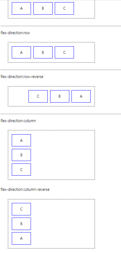
<h3>flex-direction : 아이템 주측 방향 설정</h3>
<p>기본값</p>
<div class="flex-container">
<div class="box">A</div>
<div class="box">B</div>
<div class="box">C</div>
</div>
<hr>
<p>flex-direction:row</p>
<div class="flex-container row">
<div class="box">A</div>
<div class="box">B</div>
<div class="box">C</div>
</div>
<hr>
<p>flex-direction:row-reverse</p>
<div class="flex-container row-reverse">
<div class="box">A</div>
<div class="box">B</div>
<div class="box">C</div>
</div>
<hr>
<p>flex-direction:column</p>
<div class="flex-container column">
<div class="box">A</div>
<div class="box">B</div>
<div class="box">C</div>
</div>
<p>flex-direction:column-reverse</p>
<div class="flex-container column-reverse">
<div class="box">A</div>
<div class="box">B</div>
<div class="box">C</div>
</div>
<hr>
</body>
</html>
flex-wrap
더보기
<!DOCTYPE html>
<html>
<head>
<meta charset="UTF-8">
<title>Insert title here</title>
<style type="text/css">
.flex-container {
width: 200px;
padding: 10px;
margin: 20px;
border: 3px dotted gray;
display: flex;
}
.nowrap { flex-wrap: nowrap; }
.wrap { flex-wrap: wrap; }
.box {
width: 60px;
height: 100%;
padding: 10px;
text-align: center;
border: 1px solid blue;
}
</style>
</head>
<body>
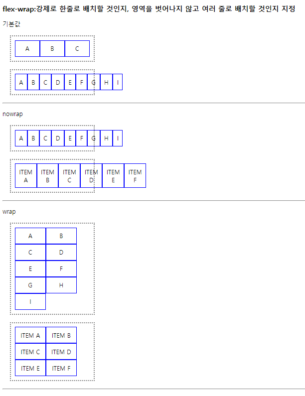
<h3>flex-wrap:강제로 한줄로 배치할 것인지, 영역을 벗어나지 않고 여러 줄로 배치할 것인지 지정</h3>
<p>기본값</p>
<div class="flex-container">
<div class="box">A</div>
<div class="box">B</div>
<div class="box">C</div>
</div>
<div class="flex-container">
<div class="box">A</div>
<div class="box">B</div>
<div class="box">C</div>
<div class="box">D</div>
<div class="box">E</div>
<div class="box">F</div>
<div class="box">G</div>
<div class="box">H</div>
<div class="box">I</div>
</div>
<hr>
<p>nowrap</p>
<div class="flex-container nowrap">
<div class="box">A</div>
<div class="box">B</div>
<div class="box">C</div>
<div class="box">D</div>
<div class="box">E</div>
<div class="box">F</div>
<div class="box">G</div>
<div class="box">H</div>
<div class="box">I</div>
</div>
<div class="flex-container nowrap">
<div class="box">ITEM A</div>
<div class="box">ITEM B</div>
<div class="box">ITEM C</div>
<div class="box">ITEM D</div>
<div class="box">ITEM E</div>
<div class="box">ITEM F</div>
</div>
<hr>
<p>wrap</p>
<div class="flex-container wrap">
<div class="box">A</div>
<div class="box">B</div>
<div class="box">C</div>
<div class="box">D</div>
<div class="box">E</div>
<div class="box">F</div>
<div class="box">G</div>
<div class="box">H</div>
<div class="box">I</div>
</div>
<div class="flex-container wrap">
<div class="box">ITEM A</div>
<div class="box">ITEM B</div>
<div class="box">ITEM C</div>
<div class="box">ITEM D</div>
<div class="box">ITEM E</div>
<div class="box">ITEM F</div>
</div>
<hr>
</body>
</html>
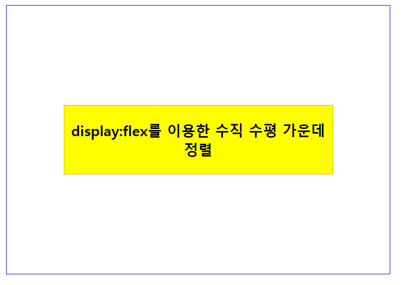
display:flex를 이용한 수직 수평 가운데 정렬
더보기
<!DOCTYPE html>
<html>
<head>
<meta charset="UTF-8">
<title>Insert title here</title>
<style type="text/css">
.parent {
	width: 500px; height: 350px;
	border: 1px solid blue;

	display: flex;
	align-items: center; /* 수직 가운데. display: flex 에서 가능 */
	justify-content: center; /* 주축 정렬. display: flex 에서 가능 */
}
.box {
	width: 350px;
	border: 1px solid orange;
	background: yellow;
}

h3 { text-align: center; }

</style>
</head>
<body>

<div class="parent">
	<div class="box">
		<h3>display:flex를 이용한 수직 수평 가운데 정렬</h3>
	</div>
</div>

</body>
</html>
justify-content: space-between
더보기
<!DOCTYPE html>
<html>
<head>
<meta charset="UTF-8">
<title>Insert title here</title>
<style type="text/css">
header {
height: 55px; padding: 1rem; color: white; background: darkblue;
font-weight: bold;
display: flex;
justify-content: space-between; /* 첫번째는 왼쪽 두번째는 오른쪽 배치*/
align-items: center;
}
nav > span {
cursor: pointer;
padding: 10px;
}
main {
min-height: 1100px;
}
footer {
height: 50px;
line-height: 50px;
text-align: center;
}
</style>
</head>
<body>
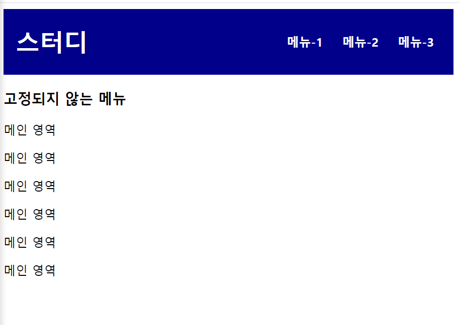
<header>
<h1>스터디</h1>
<nav>
<span>메뉴-1</span>
<span>메뉴-2</span>
<span>메뉴-3</span>
</nav>
</header>
<main>
<h3>고정되지 않는 메뉴</h3>
<p>메인 영역</p>
<p>메인 영역</p>
<p>메인 영역</p>
<p>메인 영역</p>
<p>메인 영역</p>
<p>메인 영역</p>
</main>
<footer>
<p>footer 영역</p>
</footer>
</body>
</html>
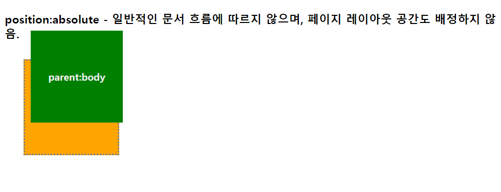
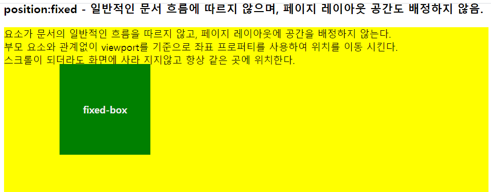
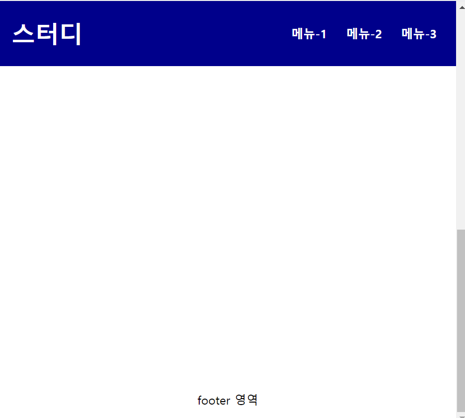
위 코드에서 메뉴영역이 스크롤을 내려도 위에 고정되어있게 하려면 position: fixed; 를 준다.
<!DOCTYPE html>
<html>
<head>
<meta charset="UTF-8">
<title>Insert title here</title>

<style type="text/css">
header {
	position: fixed; /* 자리를 차지 하지 않음. 공중에 떠있음. */
	top: 0; left: 0; right: 0;

	height: 55px; padding: 1rem; color: white; background: darkblue;
	font-weight: bold;

	display: flex;
	justify-content: space-between; /* 첫번째는 왼쪽 두번째는 오른쪽 배치*/
	align-items: center;
}

nav > span {
	cursor: pointer;
	padding: 10px;
}

main {
	min-height: 1100px;
	padding-top: 60px;
}

footer {
	height: 50px;
	line-height: 50px;
	text-align: center;
}

</style>
</head>
<body>

<header>
	<h1>스터디</h1>
	<nav>
		<span>메뉴-1</span>
		<span>메뉴-2</span>
		<span>메뉴-3</span>
	</nav>
</header>

<main>
	<h3>메뉴를 상단에 고정</h3>
	<p>메인 영역</p>
	<p>메인 영역</p>
	<p>메인 영역</p>
	<p>메인 영역</p>
	<p>메인 영역</p>
	<p>메인 영역</p>
</main>

<footer>
	<p>footer 영역</p>
</footer>

</body>
</html>
'쌍용강북교육센터 > 9월' 카테고리의 다른 글
| 0923_CSS : Grid Layout (0) | 2021.09.23 |
|---|---|
| 0923_CSS : display:flex를 사용하지 않고 메뉴 상단 고정 (0) | 2021.09.23 |
| 0923_CSS : columns 다단 (0) | 2021.09.23 |
| 0923_CSS : clip (0) | 2021.09.23 |
| 0923_CSS : Z-index (0) | 2021.09.23 |